2. Mildura POSTER


PD / 2020
From Design from Field Inveestigate
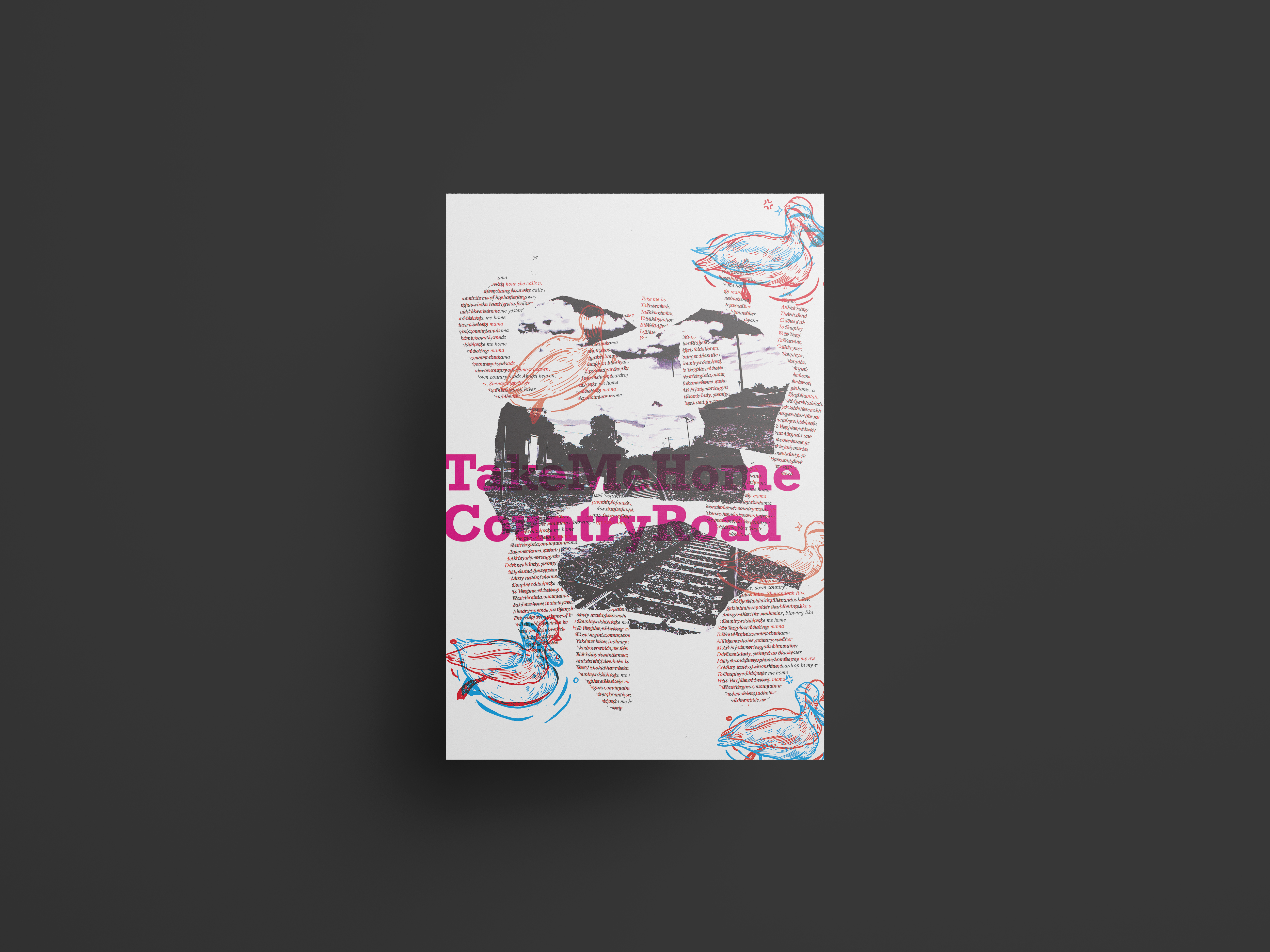
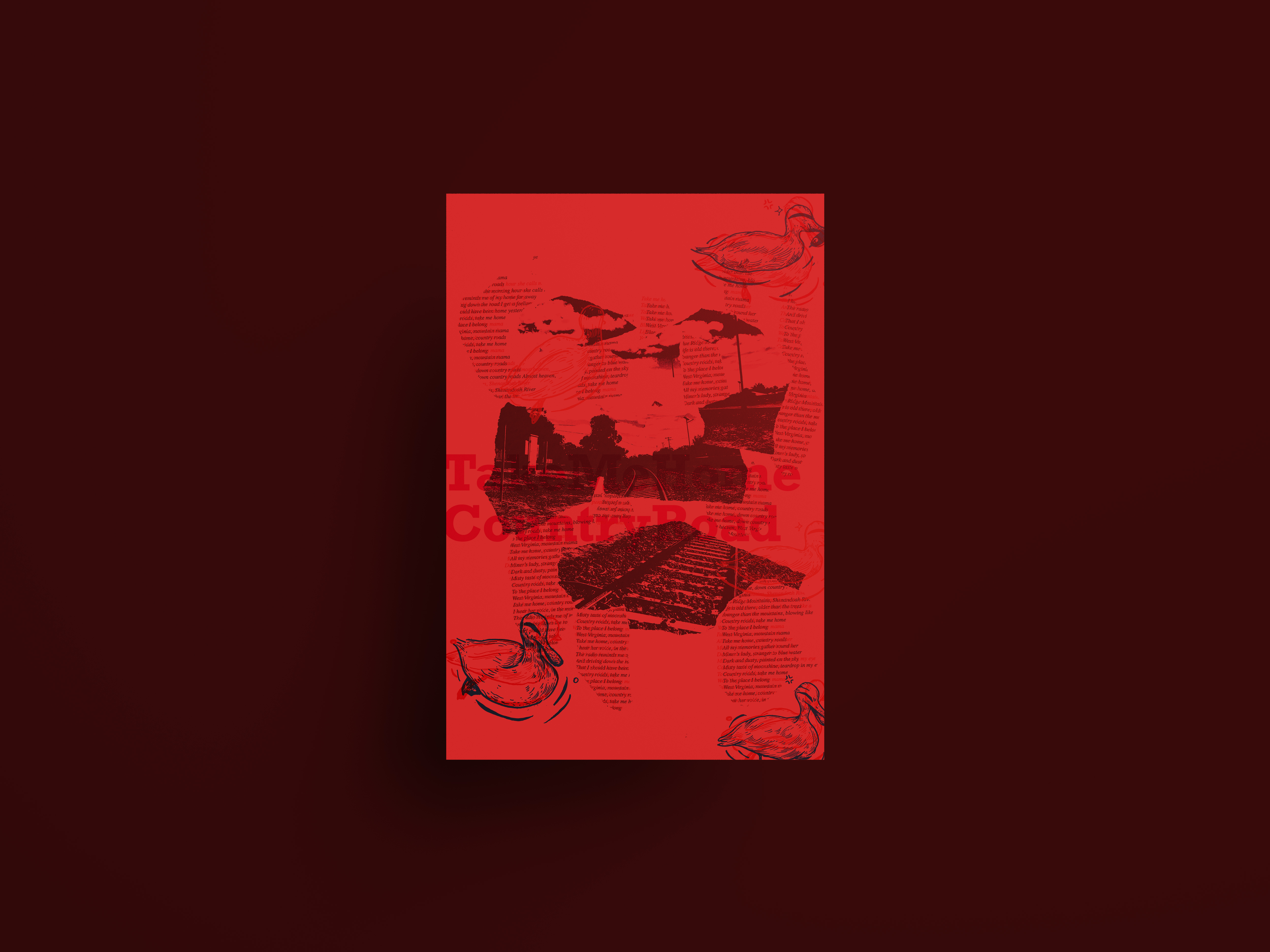
This poster is about the story and experiences that I had in Mildura, Victora. My main impression of Mildura are sand, nature and original. From these words I decided to make the whole ambience of this poster retro, with random colour and shapes. And based on the experience that we took coach from Bendigo to Mildura, I found the song ‘Take Me Home, Country Road’ can fully express my feeling. I felt like it was like getting back to the old days that I saw in the old movies, people spent lots of time on the way but they will keep going back to the place they born when they have time. I typed the lyrics on paper with classic serif font, and tared into pieces, to achieve the effect of random shapes. I designed to use red filter to show the difference, so in the lyrics part, only when people put on the red filter glasses, they can read it. I wanted to use this effect to repersent people need to spend time and patient to get back to the place they came from. Which is important. Because that’s who they originally are.
As for the image I choose a train track that I took in Mildura and adjusted it into black and white. I think train is also a good public transport to repersent the word ‘original’. It could make things slowing down.
I use the illustrations of the ducks that I draw at Mildura. This graphic elements repersents nature. And this is the most important reason that I like the experience of this trip. Those ducks gave me a lot of inspirations.
The ducks stand out on the poster when it’s with red filter.

